GARDE is an organization committed to supporting the development of disaster-affected regions by leveraging innovative technologies and forward-thinking solutions for prevention, adaptation, and community resilience
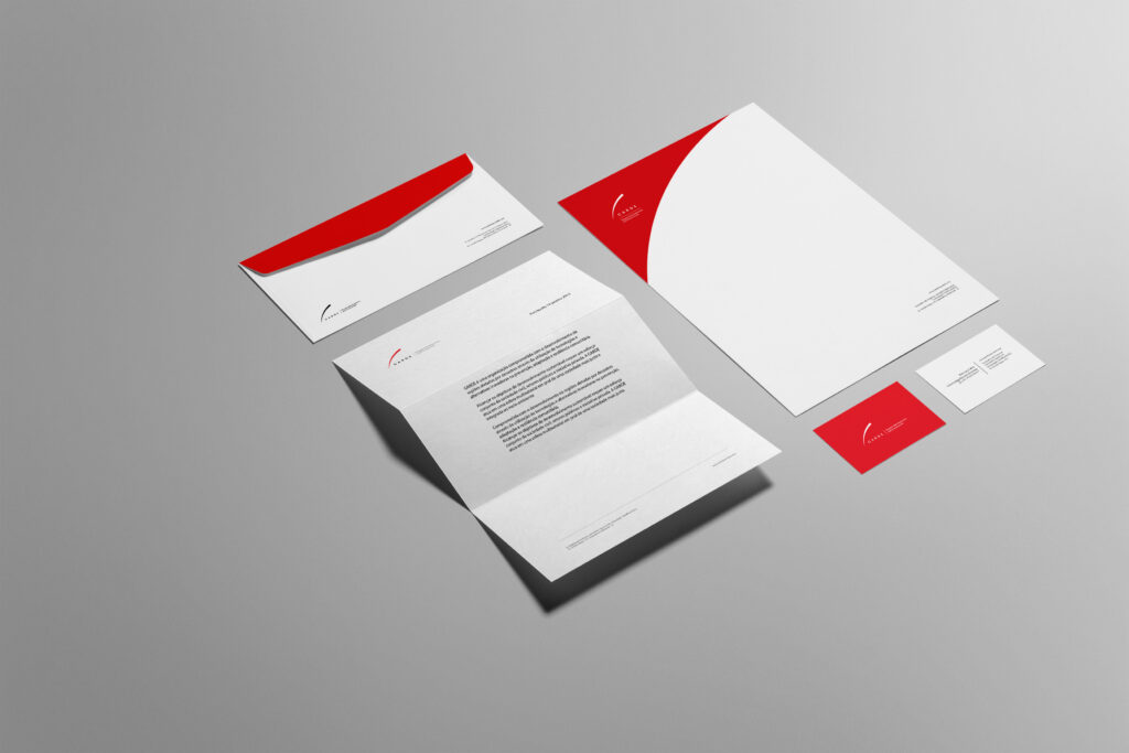
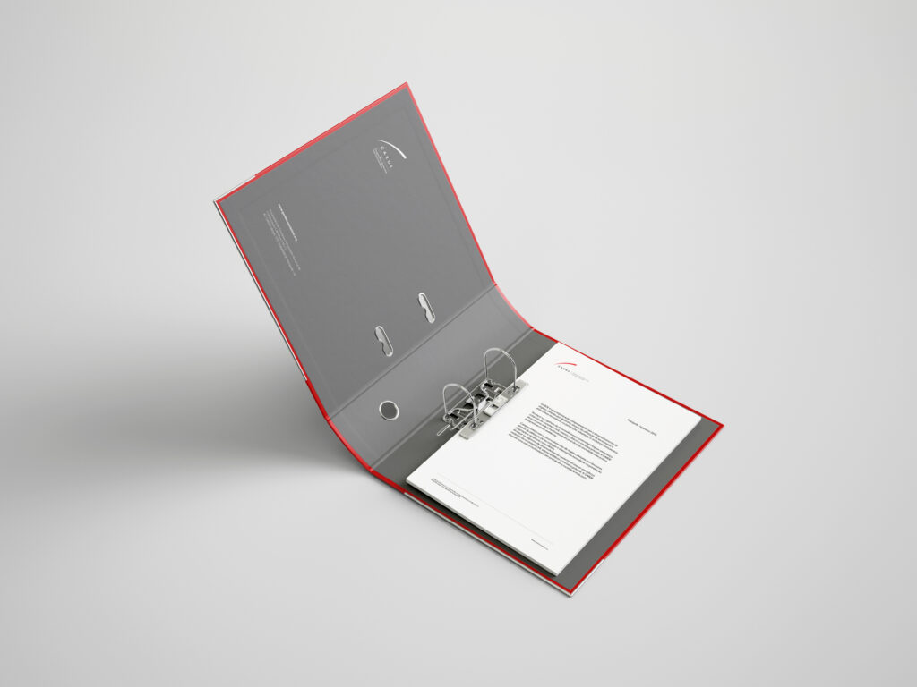
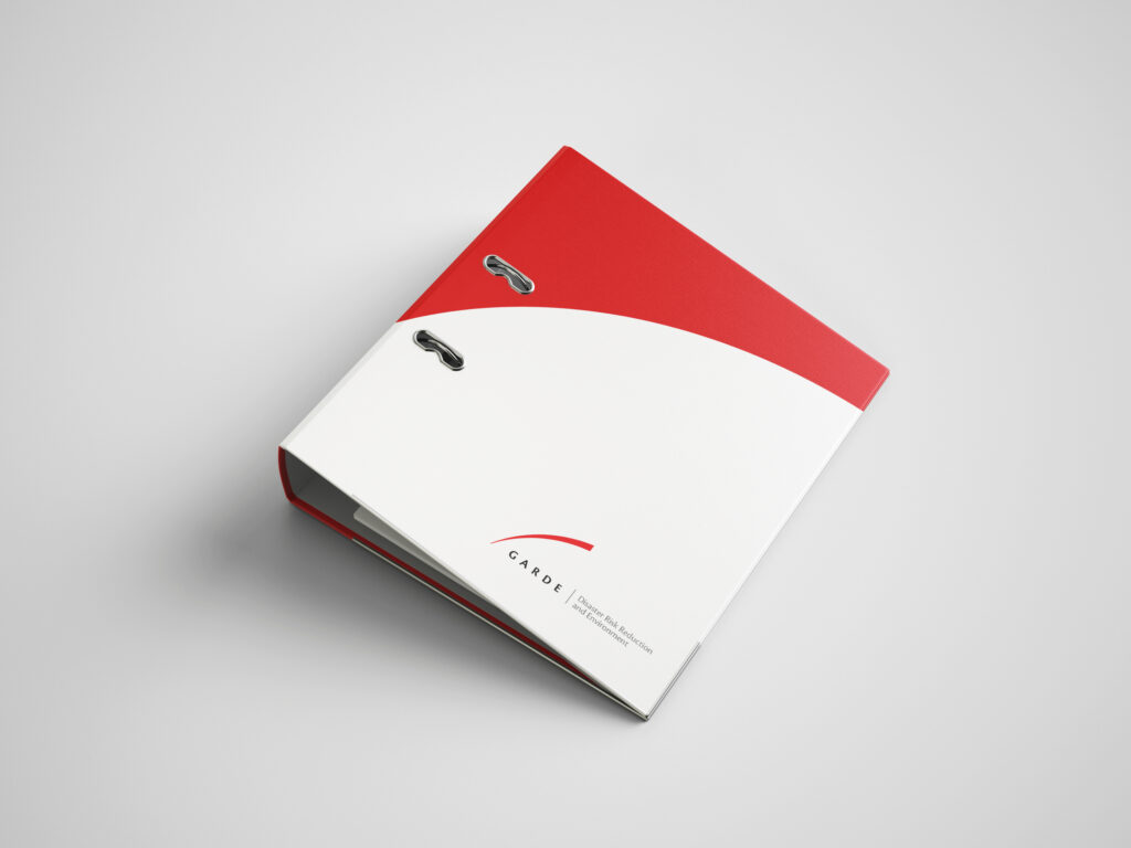
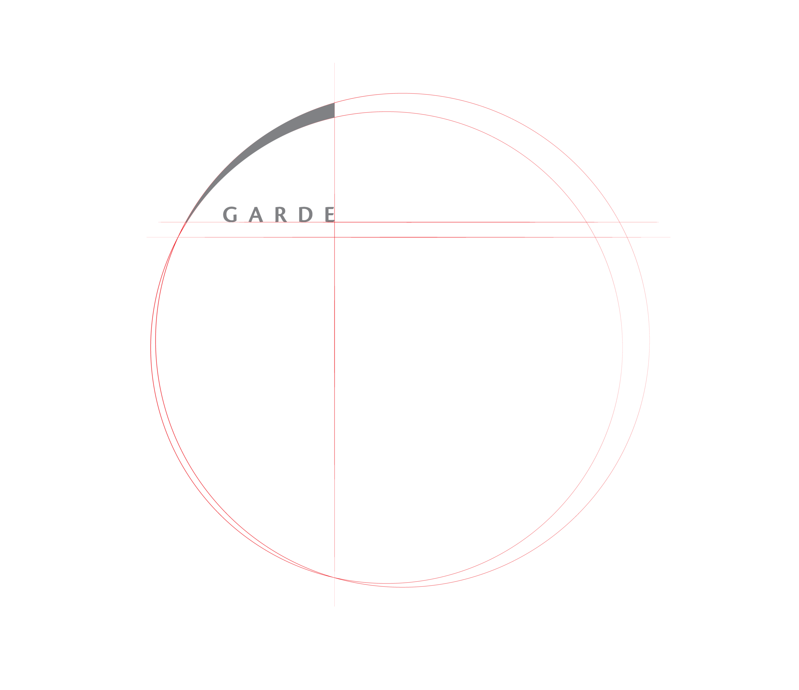
The visual identity for Garde Association is built around a bold red ascending arc, a fragment derived from the structure of eccentric circles. Rather than presenting a closed geometric form, the logo uses a single dynamic segment to suggest projection. The upward curve conveys resilience and protection, while its open composition symbolizes ongoing action and expanding impact beyond visible boundaries.
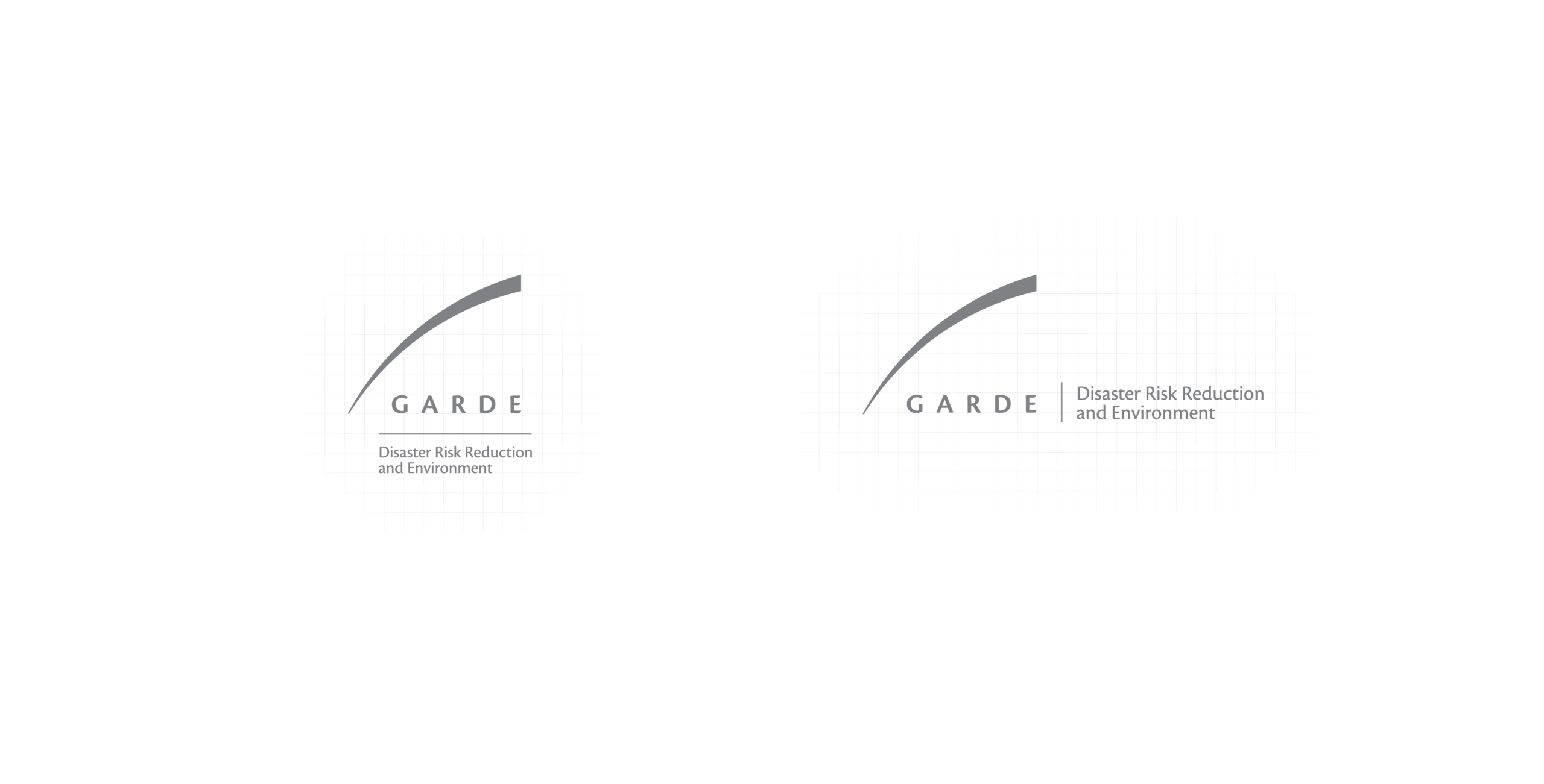
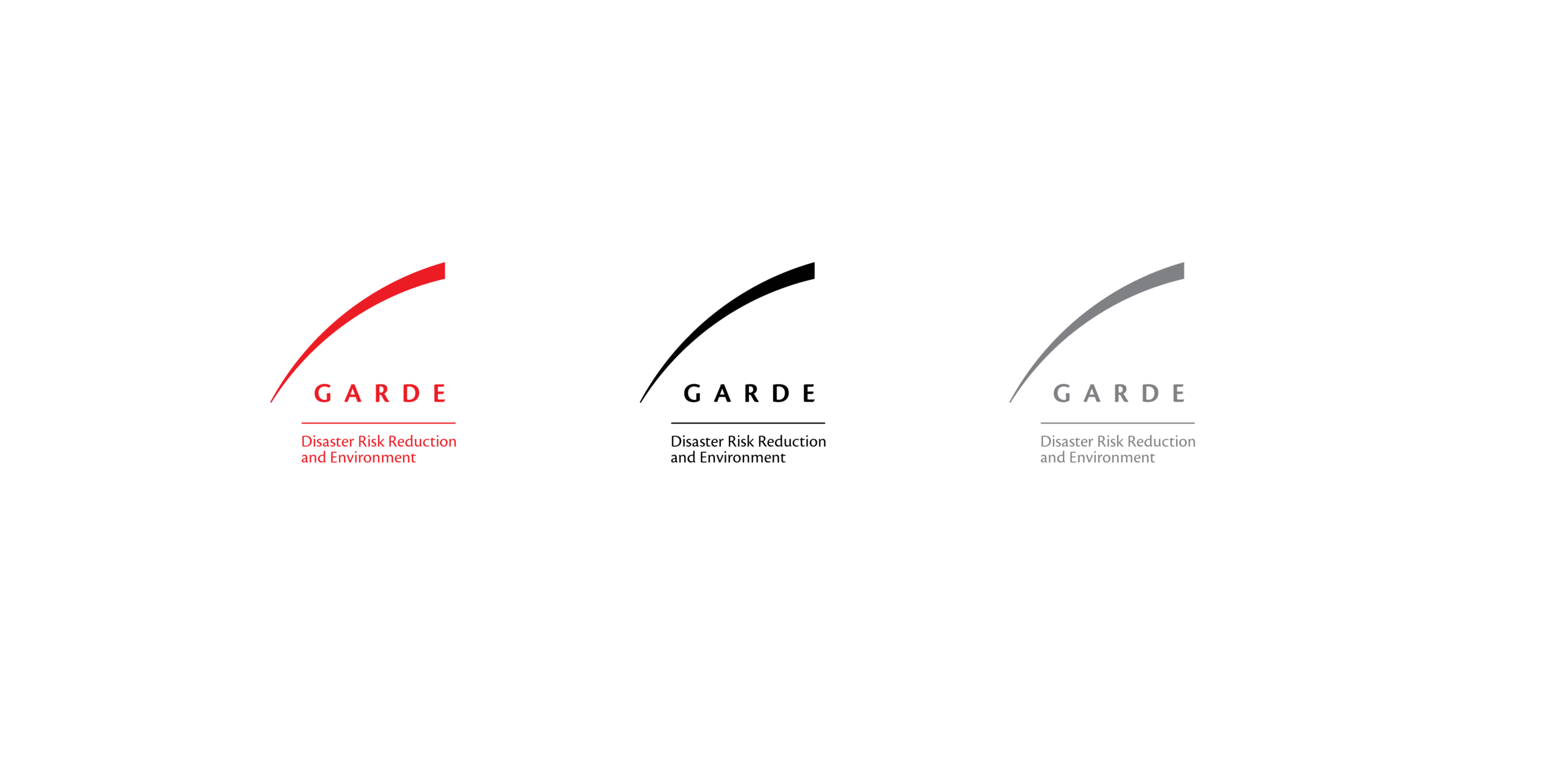
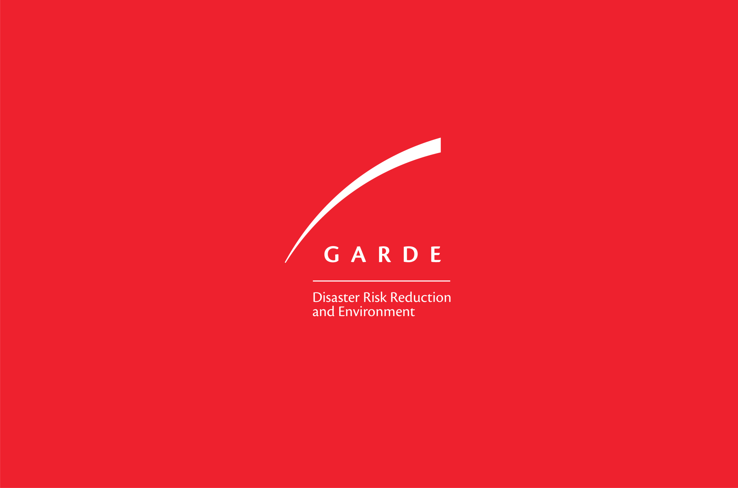
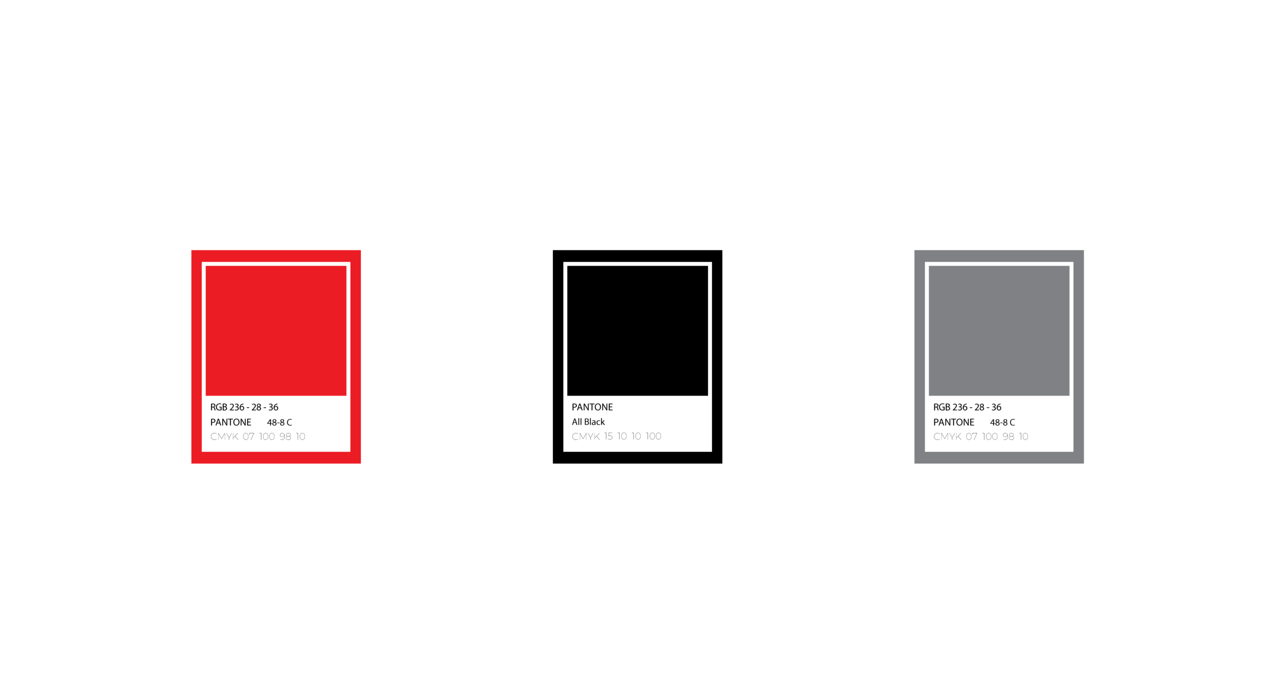
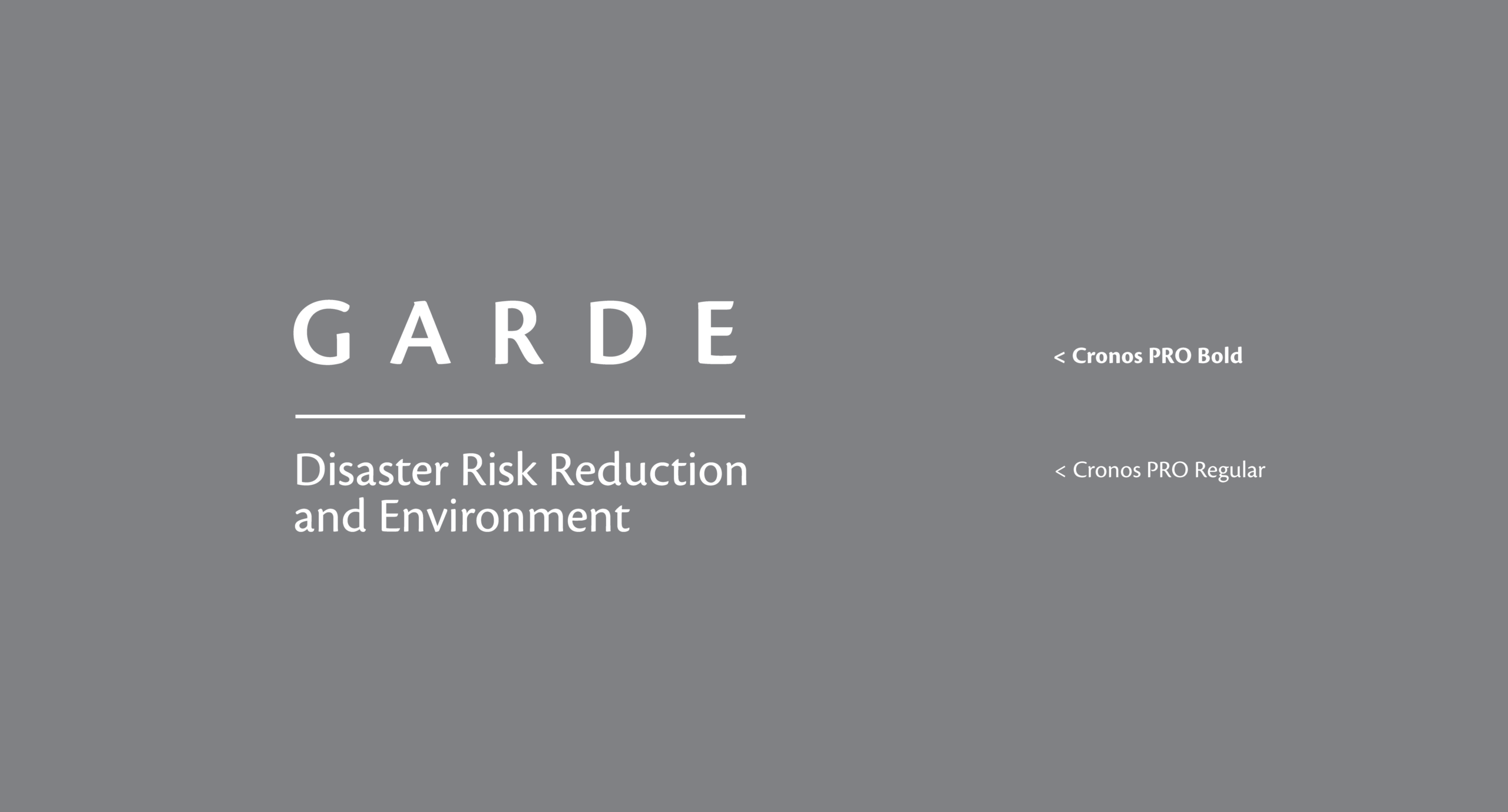
The red accent reinforces proactive response, directly aligning with GARDE’s mission in disaster risk reduction and environmental resilience. Combined with a clean typographic structure and generous spacing, the identity balances technical credibility with clarity and strength. The result is a scalable and institutional mark that communicates without visual complexity.